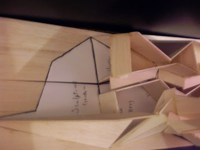


MODEL 1:100
Street and Urban Context


Overall


Sectional
Art gallery in section

Section showing cafeteria, secondary gallery and main gallery on ground level and apartment on upper level

Section showing kitchen and office on the upper level and sculpture garden on the ground level

Interior
Stairs in upper level apartment and galleries on ground level

View through open window at the rear of the apartment near the bedroom. The view through the window shows the apartment lounge room

View of Main gallery. Notice the level changes in the roof and fragmented nature of the wall which adds visual dynamism. The different triangular wall panels are not parallel to each other which makes the gallery wall undulate creating a rhythm

View of office on upper level and circulation hallway(covered with gallery walls) and workshop on ground level. The office has a large skylight above providing great views towards the top and even southern lighting. Further, the office has been designed to create an open feel in contrast to a typical wall surrounded boring office. This has been achieved by the large skylight, not having a ceiling which allows views towards the top of the high roof, omission of walls on two sides and adding balustrades allowing the occupant to look below to the galleries or to the cafeteria. The 2.5m walls have not been connected to the roof. This serves to create a continuous view of the roof


View into the workshop

View into the sculpture garden. The large continuous windows on the right serve to connect the interior to the exterior. Further, the large skylight on the left, angled such that it does not allow direct view towards the sun, floods the sculpture garden with light

View showing kitchen, upper walkway and office. Also shown is the circulation hallway below. Notice how the walkway and office floor slowly reveal the view towards the top to the person in the lower circulation hallway. As the person travels towards the middle of the hallway, the view towards the top is completely blocked. When the person goes towards the end of the hallway and enters the sculptural garden, suddenly he is presented with a large height room creating a spatial contrast

View into the kitchen with the lift on the left. The large windows and skylight provide the kitchen with nice even sunlight and great views towards the top. The skylights have been positioned such that a direct view towards the sun is eliminated and not too much sunlight can get in. Hence the spaces should feel thermally comfortable. Further, the windows and skylights could be opened slightly to allow fresh air

View into the workshop and circulation hallway

View into Main gallery

View through the galleries towards the entrance

View showing apartment. The large skylight provides nice even sunlight into the lounge room and views towards the top

View from main gallery to sculpture garden (sculpture garden not shown)

View showing the entrance. The large skylights let in southern sun, illuminating the entrance. The entrance also contains a cafeteria. The slender windows in the entrance allow outsiders to peek in through them to view the inside

View into secondary gallery. Notice the large opening. This allows reflected sunlight from the neighbour's walls to illuminate the gallery and also fresh air can flow through the gallery creating a nice atmosphere

View showing the entrance. The front part allows people to take shelter under the large glazing. People enter through the large sliding doors at the front


